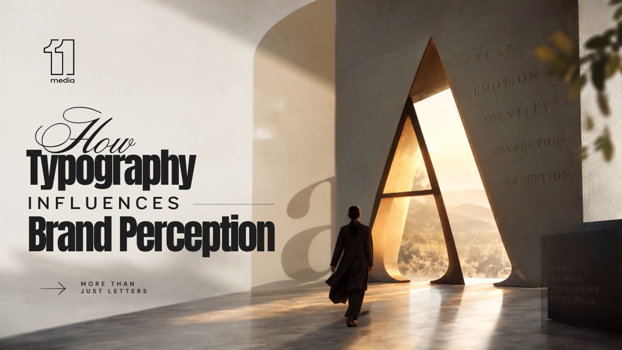
Choosing typography should start with a strategic question:
How should the brand feel?
Consider a few examples.
A premium jewellery brand may want to communicate elegance, exclusivity and craftsmanship.
A children’s brand may need something more playful and energetic.
A construction company may prefer typography that feels strong, dependable and straightforward.
A technology startup might choose something clean, modern and efficient.
The typography should support these perceptions rather than contradict them.
This is where typography becomes part of brand strategy, rather than simply a visual decoration.
Typography Can Influence How People Read Your Message
Typography doesn’t only affect personality.
It also affects readability and hierarchy.
Consider a website homepage.
The customer needs to quickly understand:
-
Who the business is
-
What it offers
-
Why it matters
-
What they should do next
Typography can help establish this hierarchy.
A large headline creates attention.
A smaller subheading provides context.
Body text delivers the details.
Buttons and calls to action need to remain easy to identify.
Good typography guides the reader through information without making them think about the design itself.
Font Choice Alone Isn’t Enough
A common branding mistake is thinking that choosing the right font automatically creates strong typography.
It doesn’t.
Typography also involves:
-
Font size
-
Font weight
-
Line height
-
Letter spacing
-
Text alignment
-
Capitalization
-
Hierarchy
-
Contrast
-
Consistency
For example, even a beautiful typeface can look poor if the text is too tightly spaced or difficult to read.
Likewise, a simple font can look highly professional when it is used with strong hierarchy and spacing.
Typography is a system, not just a font.
Typography and Brand Recognition
A strong visual identity doesn’t depend entirely on a logo.
Typography can also contribute to recognition.
When a brand consistently uses the same typographic system across its website, social media, packaging, advertisements and printed materials, customers begin to experience a familiar visual pattern.
This doesn’t mean every piece of content needs to look identical.
Instead, there should be recognisable rules that connect everything.
For example: Headline style + body font + spacing + hierarchy + visual elements = a recognisable brand system
This is especially important for businesses producing content regularly.
Typography Needs to Work Across Digital and Print
A typeface might look excellent on a large desktop screen but become difficult to read on a mobile phone.
Similarly, a font that works beautifully on a social media graphic may not be suitable for a long brochure or catalogue.
That’s why typography decisions should consider every major brand touchpoint.
These can include:
-
Website
-
Instagram
-
LinkedIn
-
Advertisements
-
Packaging
-
Brochures
-
Catalogues
-
Business cards
-
Presentations
-
Signage
-
Email communication
A good brand identity system should work across these environments while maintaining a consistent personality.
Typography and Customer Trust
Typography doesn’t create trust by itself.
But inconsistent or poorly considered typography can make a business appear less professional.
Imagine visiting a company’s website and finding:
Even if the company’s actual service is excellent, the presentation may create unnecessary doubt.
Now imagine a website with a clear typographic hierarchy, consistent fonts and comfortable spacing.
The experience feels more intentional.
That matters because customers often use visible signals to form quick judgments about a business.
Good typography doesn’t guarantee trust, but poor typography can weaken it.
Typography Should Support the Audience, Not Just the Designer
One of the biggest mistakes in typography is choosing a font because it looks impressive rather than because it works for the audience.
A brand should ask:
-
Who is going to read this?
-
Where will they see it?
-
How quickly do they need to understand it?
-
What should they feel?
-
Is the text easy to read on mobile?
-
Does the typography reflect the brand’s positioning?
For example, an extremely decorative font might be appropriate for a wedding invitation but completely unsuitable for a financial services website.
The best typography is not necessarily the most unusual.
It is the typography that fits the brand and works for the audience.
Typography in Brand Guidelines
Once typography has been selected, businesses should document how it should be used.
This is where brand guidelines become important.
A typography section in brand guidelines may define:
This gives designers, marketers and other team members a consistent reference.
Without clear guidelines, typography can gradually change as different people create content.
Typography, SEO and Digital Brand Visibility
Typography itself isn’t a direct SEO ranking factor.
But the way text is presented can influence the user experience.
Clear headings, readable paragraphs and logical content hierarchy make pages easier for visitors to navigate and understand.
This becomes even more important as businesses create content for SEO, AEO and GEO.
Search engines and AI-powered systems need clear, well-structured information to understand what a page is about.
Typography doesn’t replace good SEO.
But a clear content structure supported by good typography can make information easier for people to consume.
The bigger goal is to make your brand clear both visually and verbally.
How Should a Business Choose Its Brand Typography?
Instead of starting with: “Which font looks good?”
start with: “What should our brand communicate?”
Then consider:
1. Define the brand personality
Is the brand:
-
Premium?
-
Modern?
-
Friendly?
-
Traditional?
-
Bold?
-
Minimal?
-
Technical?
2. Understand the audience
Typography should match the expectations and reading behaviour of the people you’re trying to reach.
3. Consider every touchpoint
Test the typography across websites, social media, print, packaging and other relevant applications.
4. Prioritize readability
A distinctive font isn’t useful if customers struggle to read it.
5. Create a consistent system
Define how headings, body text, buttons and other text elements should work together.
6. Document the rules
Add the typography system to the brand guidelines so the identity remains consistent as the business grows.
The Bottom Line
Typography may seem like a small part of branding.
It isn’t.
The typeface a business chooses can influence whether its communication feels modern, premium, trustworthy, playful, technical or traditional.
But typography works best when it is connected to a larger brand identity and strategy.
A good logo can help people recognize your business.
A strong colour palette can make it visually memorable.
But typography helps determine how your brand speaks visually.
At The Eleven Media Branding & Marketing Agency, we believe branding should be more than making a business look good. Every visual decision from logos and colours to typography and layouts should support how a brand wants to be understood.
Because the right typography doesn’t simply make words look better.
It helps your brand say the right thing before the customer even reads the words.